Hello, my name is Amy Johnson and I am an A2 media student at Brigg Sixth Form. I have blogged the entire journey of the creation of my music video and ancillary products, from my first ideas all the way to the final product of my music video. I've tried to make my creative journey as clear as possible, by labeling them research or planning to what they are. In total I have 94 posts on my blog excluding my note to moderator. 4 evaluation posts, the music video, digipak, advert and additional tour poster.
I hope you enjoy my blog, thank you!
Tuesday, 14 March 2017
Saturday, 4 March 2017
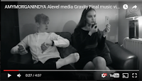
Evaluation Question 1- Directors cut
Morgan- 0:03 The first shot reveals the star name shortly followed by the star herself.
0.06 The conventional establishing shot-immediately sets the scene where Sophia is in the shower looking vulnerable and upset. She is also positioned in a way that shows the bruises on her body and face, which automatically shows the audience that the video is about abuse. We used Ken Burns to do this as we zoomed in to capture the upset in her face and so the audience clearly notices the bruises. This scene creates disequilibrium which follows Todorov’s theory that all narrative music video’s reach disequilibrium at some point and are usually resolved at the end.
0.18 The cut is on the beat which is another convention of music video and doesn’t use a fade which makes a bigger impact on the audience before she starts singing, the bruise is more prominent due to the camera angle. She is centre frame here and keeps direct eye contact with the camera, at this point she directly addressed the audience.
Amy- 0.23 She is now in the shower which symbolizes that she is trying to wash away her past of domestic abuse, she strokes her heard to resemble her emotional pain, this also reveals more of the bruise on her face. She then slowly looks back up to the camera and then reconnects with the audience with sadness and pain in her eyes after reflecting on her past. This applies to one of Goodwin’s 5 key aspects that make a music video successful… looking into camera.
0.27 We then see a gradual fade from a coloured image to a black and white image which symbolizes the audience looking back into Sophia’s past.
Indya- 0.28 We are then introduced to the male character Jason who is wearing a white dress shirt, opposing Strauss’ theory of binary oppositions since Jason was wearing a white shirt even though he is a cruel and abusive guy. This challenges the conventions of what represents a villain as a villain since in the world of media white normally represents purity and goodness. We positioned a lamp near Sophia so she appeared brighter juxtaposing the evilness of Jason symbolized by his side of the room being dark. Sophia is applying makeup with is a representation of the traditional woman trying to look good for her boyfriend. Both of them are on their phones which portrays the intertextuality of a modern relationship. Upon reflection we think this worked really well and showed that in the modern world although people use their phones to stay connected to people far away it may be tearing apart relationships closer to them.
Morgan- 0.32 The camera cuts to a high angle to show power and that Sophia is inferior to Jason. As he is male this angle reflects the representation of a male dominated society. The audience is now seeing through Sophia’s point of view as it is her memory since it is at a high angle it’s showing her in a vulnerable state.
0.30 During the lyrics “No matter what I say or do” the couple is shown arguing which results in Sophia getting hit. This visually shows that no matter what she says or does she will get abused. This adheres to another one of Goodwin’s music video conventions as he states that music video’s must link lyrics to visuals.
Amy- 0.35 The camera pans up as Jason grabs Sophia’s arm, his abrupt movement suggests his control of not only Sophia but of the camera itself.
0.37 There is a fade into the next shot as well as another high angle this time of Sophia showing her vulnerability and how she has lost all power. The way she is holding her face gives the suggestion that she has been hit and is shocked with the use of a highly dramatic reaction shot. She is centre frame again and she looks directly into camera to reconnect to the audience as a cry for help. During this scene we adhered to Propp’s theory as Jason is seen as the villain for abusing Sophia and Sophia is seen as the Villain. By allocating the actors certain roles and beheviors it makes it easier for the audience to distinguish between good and bad. For example the action of Jason hitting the singer instantly tells the audience that he is the villain.
Indya- 0.41 It then fades back to the present narrative, returning to the shower. When she sings “keep me without chains” Sophia looks down at her bruise and it reveals a clearer view of the bruise on her cheek.
0.59 As she sings the lyrics “to drown in your love and not feel your reign” we made this shot intentionally longer in order to relate the lyrics to the mise-en-scene of the shower, following Goodwins idea which matches the lyrics to visuals at the word “drown”.
Morgan- 1.05 We challenged music video conventions by using a cross dissolve into the next day shown through a change to natural lighting, and a new location is introduced. When choosing the location of this shot we wanted to use a red door because we thought it could symbolize the love and passion that was once there which she is now walking through and leaving behind.
Amy- 1.09 Adhering to conventions, the lyrics match visuals when Sophia sings “set me free, leave me be”. Sophia is seen walking out of the house as though being set free from her past.
1.14 We used continuity editing here showing her from a side angle and then changing to a front angle. We were very impressed that we go this to work as it took a lot of editing on Final Cut Pro. She walks away staring at the ground trying to compose herself while holding in her emotions.
Indya- 1.16 We used over cranking in this scene to adhere to conventions of a dramatic narrative, however this technique challenges the genre conventions of an indie/pop music video but works particularly well at showing her loss of hope and sadness as she walks away with her head down.
1.19 We use a cut here which is dramatic following into the next lines “here I am, and I stand, so tall” as she walks into camera. We used a long shot here because the location of the quiet forest helped us show Sophia’s solidarity and loneliness. This is the turning point in the song and it contrasts to the previous scene as she is now conventionally looking into camera and looks quite determined.
Morgan- 1.28 Here we cut the shot to the same shat but just zoomed in on her face. In our opinions this was a successful attempt at showing the seriousness in her face and by being so close to her it shows her gradual build up of power. We decided to do this on the line “supposed to be” because it shows a change of personality and emotion from the artist.
1.30 Another cut is used here and we see another black and white memory again. As we found out from our focus group they wanted to see some positive connotations of the male lead. This is why we showed a happy memory. Allan Cameron can be applied here through his idea of anachronic narrative, which in this case is shown as flashbacks. We also zoomed closer into the shot when Sophia started laughing to show that the couple were happy together at one point and their relationship wasn’t always that bad. This gives the audience another view of the situation and leaves them wondering what made Jason into the controlling, manipulative boyfriend he is in the present narrative.
1.38 A fade is used in the next shot which then zooms out using Ken Burns which not only reveals more of the mise-en-scene but also more of the star which draws the audience back to her facial expressions. This was also successful in showing that she was reminiscing due to her slight smirk.
Amy- 1.50 The next shot cuts to another memory. It’s a high angle shot to show the positioning and to represent them as a couple being in bed together. Jason is shown as being immersed in his phone again which we used to show how controlling technology is in a modern society. The audience is originally given the impression that this is happy memory until later it is revealed that through the use of over cranking that he is being abusive again. At the lyric “all my fragile strength is gone” she throws him off of her showing that she is actually standing up for herself, which is the only time this is shown in the music video. Jason is then seen falling to the pillow after letting Sophia go. He looks angry but he doesn’t care enough to go after her.
Morgan- 2.02 This scene continues from the memory however this is the part in the narrative where she realizes her strength, we are showed her change by having it in colour however this is another memory. She looks at her bruises again showing the realization that she is done with the relationship as she looks up on the like “I don’t want to fall another moment into your gravity” as if she is speaking to herself as she is talking into the mirror.
Indya- 2.15 During this section of the narrative Sophia is taking a reflective walk in the forest debating whether or not she should leave her toxic relationship. Following this she leans against a tree left of frame. When she sings “so tall, just the way I’m supposed to be” it relates to the trees, being so tall and strong. During selection and rejection we chose this shot in particular because of the way the wind blows through her hair giving her a naturally powerful look. Upon reflection, having Sophia in this location highlighted the fact that although she is alone and in a quiet forest she is still gaining the strength to break up with Jason.
Morgan- 2.16 Ken Burns successfully enabled us to meet a key convention of a music video for a new artist- the camera zooms steadily into a close up enabling the audience to connect with Sophia as an artist and a person.
2.32 We fade to another shot during the long note to a new location. We thought this location was a prime location due to the large amounts of natural light although looking like an indoor setting. Here it is a short shot giving the audience a glance of present time, so it is clear that this is where the narrative is continuing from.
Amy- 2.36 The song now gets more intense which is show through the lyrics and speed of the song. We thought it would make a big impact if we added a new location at the climax of the song. At “everything I think I need” she looks at the graffiti of the couple’s names. “Here on the ground” when she is sat on the ground with the couples names on the wall above her and behind her symbolizing that it had a big impact on her life and was now in the past.
2.47 It then cuts back to the location where she is observing the photo of her and Jason with an over he shoulder shot. The lyrics “” you’re neither friend or foe’ relating to Strauss’ theory of binary oppositions, as shown by the picture being torn in half. This also shows her frustration as she is alone and rips up her photo, her actions contrast to the lyrics since although she sings, “can’t seem to let you go” and lets go of the picture, she still can’t let him go emotionally.
Indya- 2.52 The camera then cuts back to the previous location where we used Ken Burns to zoom out and capture the broken and vandalized wall behind her. Conventionally, she is centre frame again in the middle of a derelict wall which is a representation of how she is feeling in the relationship with Jason and how it has been ruined by his cruel and destructive behaviour.
Morgan- 3.10 This scene shows Sophia reflection upon when Jason abused Sophia and here it all started going wrong. Upon reflection I wish that we showed more of Jason’s side of the story and why he acted the way he did. This scene reinforced the importance of why Sophia needs to leave the relationship due to her reflecting on past memories of abuse. We broke the standard conventions of a music video when we applied Cameron’s “forking path’s” theory here as this scene suggests that Sophia is undecided on what she should do with the relationship but could suggest that she is thinking more about leaving him.
Amy- 3.19 For this shot we used a close up, side angle shot of Sophia to capture the emotion in her face. We also wanted to capture the tear going down her face to represent the upset and struggle. This shows that we followed Barthes theory of signs and signifiers as the tear is used as a symbolic sign to represent sadness as this works in cohesion with her facial expression to tell the audience that she is obviously upset that she has to leave all of her positive memories behind.
3.30 This shot now fades into ken burns straight away as the shot was not very long compared to the other shots in this video as we wanted to show her looking on her phone as well as making the audience notice the expression on her face. We wanted her face to be the feature of this shot as this was the last shot of her in he video so we wanted it to be important and show her final emotion towards the outcome of the situation of her looking vulnerable and hurt.
Indya- 3.38 We then used a fade transition to move onto the next shot as we wanted to keep the audience focused onto her phone. We leave the phone in the centre of the frame for a few seconds to give the viewer time to read the text message and see why her emotion changed for the last shot. We used Facebook Messenger to represent a modern relationship as the final shot showed a screenshot of Jason’s Facebook relationship status showing him as being single, using intertextuality. If I were to change one thing about the music video it would be the clarity of this text. In my opinion the relationship status doesn’t stand out as much as we wanted it to so to fix this, next time we could use an extreme close up of the word “single”.
Morgan- 3.48 We manually zoomed the camera out to reveal the photo that had been torn in half earlier in the video either side of the phone with Jason and Sophia either side of it. This was another representation that technology has come between them and torn them apart in real life.
3.50 for the final shot in our video we use a fade transition so the shot changes to a helpline message for people who have been affected by domestic abuse or suspect it. We thought that this would be a good idea to incorporate into the end of our music video as one of the actual music video’s we researched during the research phase had this. It is a convention of an informative/promotional music video to have text at the end to clearly tell the audience what they watched and how they can get more information.
Friday, 17 February 2017
Evaluation question 2
Q)How effective is the combination of your main product and ancillary texts?
In the construction our the music video and the ancillaries we tried to create as much synergy as we could do, to get our audience to recognise Sophia's products. In my opinion the main method to create synergy between our products was through the use of the same image of Sophia, where she is seen looking directly into camera but hiding her face behind the fur suggesting that she has a secret. This image is seen on the digipak front pane and the advert. In the video we used black and white as a method to show the difference between the past and present time so the narrative was clear for the viewer. However deciding to use black and white images carried synergy through to the other products and also worked really well by looking effective on the colour pop we used.




On the right it the digipak advert that we decided to use to base our advert on. In the advert Jessie J is seen looking directly into camera, we decided we wanted to do this on our advert as it is ecstatically pleasing due to the artist having direct attention of the audience due to the main focus being on her face. Jessie J also used the same photograph for her advert as she did her digipak, this we thought was a fantastic idea as it created synergy between the products and also makes the product easily recognisable from the advert. Like in Jessie J's advert we decided to use the artists face on the advert instead of the digipak as it is introducing to the audience who the star is. Applying theory to our digipak, Winships 'the gaze' can be applied here as the image on the front of the digipak portrays Sophia's beauty and due to her eyes being the main focus of the video it is extremely intriguing to a buyer as it really grabs attention, through her intense stare. The idea of having Sophia's name and the album name in the centre of the advert we liked on Jessie J's advert as it kept the synergy from the advert due to the digipak and also made it very noticeable and stood out against the picture. Upon reflection I wish we had used a different colour for the writing to make it stand out more, like on Jessie J's album she uses an extremely bold black and silver fonts which really stands out against her white background, whereas the 'Fate' on our digipak isn't that eyecatching from far away. I believe the font we decided to use in the end was extremely successful as it was classy but without making her look too old. The font was consistent between all three of the products, the music video, the digipak and the advert which created synergy between the products. Also the font due to being used throughout creates a brand identity as this font by the audience would be associated with Sophia.
Here we have created synergy between the music video and the digipak. This synergy has been created through the use of the same colour for her name on the music video and the digipak cover, and also on the digipak the colour is used again to advertise the name of the album and that it is including her number one single gravity. Upon reflection I wish the colour we decided to use to create synergy was brighter and this colour I feel gets lost amongst the rest of the image. If we had used a different colour though it would not create synergy with the dress that Sophia is seen wearing in another one of the panes of the digipak. I think it was a great idea we had to use the same colour as her dress and it easily creates synergy though all of the products, but I think as an after thoughts we should of thought more carefully about the colour of her costumes if we wanted to use the colour of one of her outfits as the colour for all of the text.

 In the music video the dark scenes in the narrative where domestic abuse was shown we used a black and white effect. Having these shots in black and white makes the narrative clear that they're in the past, making the narrative easy to follow for the viewer. Synergy was created through the black and white scenes in the music video and having the black and white images on the digipak. On the digipak we used a colour popped image to make Sophia the main focus of the image, we tried to create a similar thing in the scene in the music video where Sophia is wearing the same dress however the colour smashed in other places than just the dress leaving orange splurges in random places, so we decided that we would not use it as it looks unprofessional. On the CD it is using the same colour as all of the titles creating synergy and has a black background, having the black background shows that she has a happy side being the purple, but the grey bit representing that not everything is at it seems in her life referring to the domestic abuse.
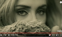 We used inspiration here for the image on the front of the digipak from Adele's 'Hello' music video. This shot of Adele I find extremely interesting as the music video is about her showing off her new self as she has recreated herself. The idea of hiding behind the fur suggests to the audience that there is something secret about this person, or although they are trying to hide something, in Sophia's case the fact she is a victim of domestic abuse.
However, for her name on the digipak advert we decided to make the font slightly darker so her eyes were the main focus on the advert. Also we thought that the darker colour showed a sign of maturity rather than the pinker colour.

 In the music video the dark scenes in the narrative where domestic abuse was shown we used a black and white effect. Having these shots in black and white makes the narrative clear that they're in the past, making the narrative easy to follow for the viewer. Synergy was created through the black and white scenes in the music video and having the black and white images on the digipak. On the digipak we used a colour popped image to make Sophia the main focus of the image, we tried to create a similar thing in the scene in the music video where Sophia is wearing the same dress however the colour smashed in other places than just the dress leaving orange splurges in random places, so we decided that we would not use it as it looks unprofessional. On the CD it is using the same colour as all of the titles creating synergy and has a black background, having the black background shows that she has a happy side being the purple, but the grey bit representing that not everything is at it seems in her life referring to the domestic abuse.
  We used inspiration here for the image on the front of the digipak from Adele's 'Hello' music video. This shot of Adele I find extremely interesting as the music video is about her showing off her new self as she has recreated herself. The idea of hiding behind the fur suggests to the audience that there is something secret about this person, or although they are trying to hide something, in Sophia's case the fact she is a victim of domestic abuse.
Sunday, 5 February 2017
Evaluation Question 3
Q3 evaluation finished from AmysMediaslides
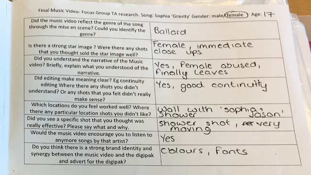
Throughout this journey it has become noticeable to me how invaluable in developing creativity and ensuring that my music video met target audience requirements. Conducting target audience for example from a focus group is an extremely effective method because it allows the target audience to suggest what the want and their ideas that are so valuable as it becomes a catalyst for more ideas just from a idea from the target audience.
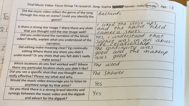
Throughout this journey it has become noticeable to me how invaluable in developing creativity and ensuring that my music video met target audience requirements. Conducting target audience for example from a focus group is an extremely effective method because it allows the target audience to suggest what the want and their ideas that are so valuable as it becomes a catalyst for more ideas just from a idea from the target audience.
Additional target audience research
This is some additional target audience research that we created for some members of our target audience. This research was created for use after we had completed our music video to get some feedback on what people thought of the completed product.From this research we found that the vast majority of the comments were positive and that people understood the narrative and understood the synergy and the brand identity that was created for Sophia.

Saturday, 4 February 2017
Evaluation Question 4
Q) How did you use media technologies in the research and planning stage?
During the process of creating my music video it would of been impossible without the use of internet technologies. Thing link was extremely useful for the analysis of magazine adverts because you can easily add a pin onto the image and then it was easy to see the evaluation point for that part of the music video. This year during A2 I have found the presentation of my blog much better, this is probably due to having a better understanding of where things are on the blog, also having my blog linked to Morgan and Indya's was useful as we could easily see what eachother was doing. I find that Prezi is more useful for evaluations than analyzing a music video due to only being able to write a small amount in each bubble which wouldn't be good for analyzing a music video. Powtoon is a great piece of software for putting a large amount of text into digital technology
Q)How did you use media technologies in the construction stage?
During construction I used my blog to store all of the drafts of the ancillaries (the digipak drafts and the advert drafts). Having my blog proved really useful as I could post things on it like screen grabs then Morgan and Indya could get them from my blog and vice versa.
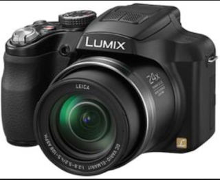
During A2 my skills of using a camera for media has massively improved. During AS you use a camera to take just still photographs for your magazine, whereas at A2 you have to film as well as take pictures using the same camera. During the construction stage of the music video whilst we were filming the shots I learnt a lot about the camera and different things you need to ensure you do to make sure you have the best result possible. One key point I learnt during my construction journey was to when filming on the camera ensure you start it filming a few seconds before the shot starts so it doesn't cut off the beginning of the shot, and similarly at the end of the shot leave it running a few seconds longer so the end it also not cut off.
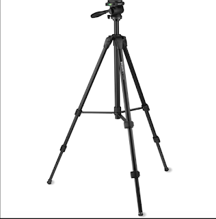
Similarly to the camera we also used a tripod at AS, however it had much greater purpose at A2. Having a tripod during the construction stage of our music video was crucial due to it enabling that the camera was still for every shot so the shots taken looked as professional as we could possibly make them. Also on the tripod there is a little spirit level on the side which tells you if the tripod is straight, this is a really useful feature as it ensure's that the shots are all equal. Having the tripod also aided us during shooting high and low angle shots by being able to tilt it so the camera was facing a new angle yet still still and level, to ensure the professional look was upheld.
At A2 during construction Instagram was used to gather some target audience research and logo's for our company 'Rebel Records'. Using social media was a great way to gather target audience research due to reaching people of our target audiences age without them having to fill in a questionnaire. We found the results from this target audience research exceptionally useful due to gathering other people's idea's for our company logo to make sure the logo reflected the type of company we are.
Final Cut Pro X was a major piece of software used in the construction of my music video. At the beginning of my construction journey I found this software very overwhelming due to the enormous amount of functions that it had and that you could complete on it. I originally found it quite frustrating as I wanted to do things to my music video but I couldn't as I didn't know how to do them. After using the software a couple of times and having the practise run on Final Cut Pro X I really started to get the hang of it and understood where things were and how to do the functions I wanted to do.
Turning the memories black and white:
Over cranking:
In the scene in the music video where Sophia is seen leaving the house we decided to use over cranking to show her at the end of the path. We created this by changing the speed of the clip, however we only wanted to change the speed of the end of the clip. To do this we used the blade tool to blade off the end of the clip so it was a separate shot and then we selected in and changed the speed of the shot. We decided to change the speed of the clip so the lyrics matched better with the visuals, as now the over cranked visuals are on the lyrics "I don't want to fall another moment into your gravity", changing the speed of this shot to fit to the lyrics also helped as we could then start the next shot which was a change in location at the start of a new line in the song which made the video look neat and professional.
Tools:
In this drop down tool menu in my opinion have the most usual tool on Final Cut Pro X. The select tool was really useful for moving the different clips around and especially at the beginning when we had to move our footage onto the time line using the select tool made it really simple to select what you wanted to from the time life or effects. The trim tool was extremely useful as it could shorten but also increase the length of shots if the timing had just gone off a little. The trim tool was especially useful when you added a transition in earlier in the timeline and it would knock the clips slightly out of time, so by using the trimming tool it was easy to just drag the end back a little to extend.
Markers:
Transitions:
After completing putting the music together and posting our rough cut it was then time to make the music video look more professional by adding transitions. During the research stage of our music video we researched artists like Adele and Taylor Swift, from the research we found that they use a range of transitions and cuts. In the video we decided to use cuts mainly when it was changing from one location to another or when Sophia was singing straight away, however we decided to use transitions such as cross dissolve (like seen in the screen capture above) to add tension to the narrative. Using transitions such as blur and fade out allows the audience to see her emotion for longer when she's not singing.
Vignette mask 1:
Vignette mask 2:
Ken Burns:
We used Ken Burns on some of our shots to zoom them in/zoom them out. Kens Burns is effectively the same as just the zooming tool on a camera, however it is much neater. Ken Burns is really easy to use and has greats tidy results, which you probably wouldn't get if you just zoomed the camera in manually. We also used this tool in developing our creativity as in some of our shots that was things we did not want in them for example in the screen capture about there was a taboo word graffitied on the wall so we used Ken Burns to cover that up.
Disabling the audio:
One of the final steps of constructing our music was to detach the audio. To give the real impression that Sophia was our artist and she was actually singing, once the lyrics and the visuals were matched up we detached the audio so it was Sara Bareilles singing. Being able to detach the audio was also useful to use when in the sinking process as we could insert a clip, then sink it up and then finally to double check its in time detach the audio.
Problems with changing the dress colour:
In the abusive scene where we see Jason the male character hit Sophia we tried to use the colour changing tool to try and make Sophia's dress red which would symbolise love, but also danger. This was something we had planned early on in the planning stage and make sure everything around it was right e.g Sophia wearing a read dress. However when we came to turn the dress red it kept the dress red, but there was patches of orange other places in the shot like on Jason's face, the cushion and the inside of Sophia's leg. We decided to take the red dress out as it looked unprofessional to have random orange patches everywhere.

The making of:
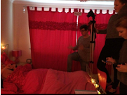
In this production still we were filming the flashback scene to where the viewer see's Jason being aggressive by grabbing Sophia's arm and the first time Sophia is seen as being strong and leaves the situation, however Jason doesn't care enough to go after her. In the still all three of us was doing a different job to contribute to the filming of this scene. Indya can be seen holding a phone, she was controlling the music and reading the directions that we had made on our storyboards, Morgan was giving direction and instruction from what he could see from the viewers perspective and I was filming the scene. The main problem we had during the filming of this scene was the issue of getting the lighting right, as the scene needed to be dark to reflect nighttime, however it couldn't be too dark or we would loose the facial features of Sophia and Jason. In the end we shut the blinds and the curtains, turned the main lights off and had fairy lights on the top and the bottom of the bed, however this was still not enough as there was shadows on the actors faces. In the end we got Amy one of our friends who was helping us out during the filming stage of our music video to stand on the table and hold a lamp aiming it at Sophia and Jason so their faces were light enough to see their facial expressions on the camera.
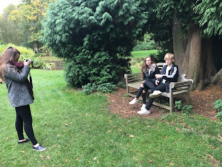 During our first two days of filming we realized that we didn't take many photos, or nowhere near enough photos to use for our digipak and advert. So during our third day of filming at Normanby Hall we ensured that we took lots of photo's so we had a variety to choose from. However, looking back on the photos the best ones we took were just of Sophia, as we took some with Jason on however they either looked too nice to say they were in a domestic relationship or they looked to staged which doesn't look professional to put on a digipak for a new star.
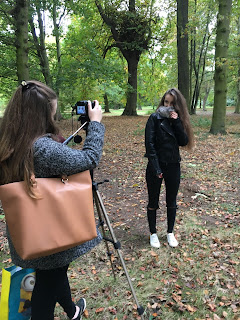
Seen in this shot we used natural backgrounds and framing as much as we could when we were filming as it showed the vulnerability of Sophia in large open spaces. The shot that is being shown in the above production still is a shot that we were inspired for by Adele's 'Hello' music video for this shot, as we thought it would be interesting to explore as it shows her vulnerability. We took numerous shots similar to this one but just with Sophia looking in different directions.
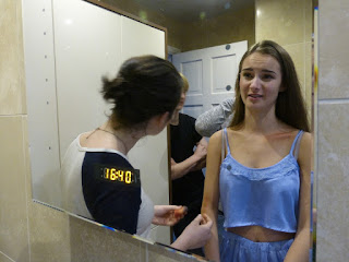 In the photo Amy is appearing, she was a friend that we used who is incredible at makeup so she came along to our filming days to help us with the bruises we needed for Sophia.
Amy Johnson's Slidely Gallery by Slidely Photo Gallery
Friday, 27 January 2017
Tuesday, 24 January 2017
Reason for change to digipak advert draft.
This is one of the final drafts for our digipak poster. However this is not the completed version due to us removing the image of the digipak cover not being on the frontcover as we believe it doesn't look right for the rest of the advert. Having the digipak cover on the front of the digipak advert is conventional, therefore we tried to put it on. The problem with having it on is the photograph on the front of the digipak is the same as the photo used for the advert, this is why we feel not having the digipak cover on the digipak advert would make the advert look better and more professional.
Monday, 23 January 2017
Subscribe to:
Comments (Atom)


