Q)How effective is the combination of your main product and ancillary texts?
In the construction our the music video and the ancillaries we tried to create as much synergy as we could do, to get our audience to recognise Sophia's products. In my opinion the main method to create synergy between our products was through the use of the same image of Sophia, where she is seen looking directly into camera but hiding her face behind the fur suggesting that she has a secret. This image is seen on the digipak front pane and the advert. In the video we used black and white as a method to show the difference between the past and present time so the narrative was clear for the viewer. However deciding to use black and white images carried synergy through to the other products and also worked really well by looking effective on the colour pop we used.




On the right it the digipak advert that we decided to use to base our advert on. In the advert Jessie J is seen looking directly into camera, we decided we wanted to do this on our advert as it is ecstatically pleasing due to the artist having direct attention of the audience due to the main focus being on her face. Jessie J also used the same photograph for her advert as she did her digipak, this we thought was a fantastic idea as it created synergy between the products and also makes the product easily recognisable from the advert. Like in Jessie J's advert we decided to use the artists face on the advert instead of the digipak as it is introducing to the audience who the star is. Applying theory to our digipak, Winships 'the gaze' can be applied here as the image on the front of the digipak portrays Sophia's beauty and due to her eyes being the main focus of the video it is extremely intriguing to a buyer as it really grabs attention, through her intense stare. The idea of having Sophia's name and the album name in the centre of the advert we liked on Jessie J's advert as it kept the synergy from the advert due to the digipak and also made it very noticeable and stood out against the picture. Upon reflection I wish we had used a different colour for the writing to make it stand out more, like on Jessie J's album she uses an extremely bold black and silver fonts which really stands out against her white background, whereas the 'Fate' on our digipak isn't that eyecatching from far away. I believe the font we decided to use in the end was extremely successful as it was classy but without making her look too old. The font was consistent between all three of the products, the music video, the digipak and the advert which created synergy between the products. Also the font due to being used throughout creates a brand identity as this font by the audience would be associated with Sophia.
Here we have created synergy between the music video and the digipak. This synergy has been created through the use of the same colour for her name on the music video and the digipak cover, and also on the digipak the colour is used again to advertise the name of the album and that it is including her number one single gravity. Upon reflection I wish the colour we decided to use to create synergy was brighter and this colour I feel gets lost amongst the rest of the image. If we had used a different colour though it would not create synergy with the dress that Sophia is seen wearing in another one of the panes of the digipak. I think it was a great idea we had to use the same colour as her dress and it easily creates synergy though all of the products, but I think as an after thoughts we should of thought more carefully about the colour of her costumes if we wanted to use the colour of one of her outfits as the colour for all of the text.

 In the music video the dark scenes in the narrative where domestic abuse was shown we used a black and white effect. Having these shots in black and white makes the narrative clear that they're in the past, making the narrative easy to follow for the viewer. Synergy was created through the black and white scenes in the music video and having the black and white images on the digipak. On the digipak we used a colour popped image to make Sophia the main focus of the image, we tried to create a similar thing in the scene in the music video where Sophia is wearing the same dress however the colour smashed in other places than just the dress leaving orange splurges in random places, so we decided that we would not use it as it looks unprofessional. On the CD it is using the same colour as all of the titles creating synergy and has a black background, having the black background shows that she has a happy side being the purple, but the grey bit representing that not everything is at it seems in her life referring to the domestic abuse.
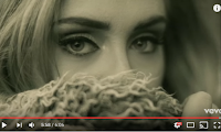 We used inspiration here for the image on the front of the digipak from Adele's 'Hello' music video. This shot of Adele I find extremely interesting as the music video is about her showing off her new self as she has recreated herself. The idea of hiding behind the fur suggests to the audience that there is something secret about this person, or although they are trying to hide something, in Sophia's case the fact she is a victim of domestic abuse.
However, for her name on the digipak advert we decided to make the font slightly darker so her eyes were the main focus on the advert. Also we thought that the darker colour showed a sign of maturity rather than the pinker colour.

 In the music video the dark scenes in the narrative where domestic abuse was shown we used a black and white effect. Having these shots in black and white makes the narrative clear that they're in the past, making the narrative easy to follow for the viewer. Synergy was created through the black and white scenes in the music video and having the black and white images on the digipak. On the digipak we used a colour popped image to make Sophia the main focus of the image, we tried to create a similar thing in the scene in the music video where Sophia is wearing the same dress however the colour smashed in other places than just the dress leaving orange splurges in random places, so we decided that we would not use it as it looks unprofessional. On the CD it is using the same colour as all of the titles creating synergy and has a black background, having the black background shows that she has a happy side being the purple, but the grey bit representing that not everything is at it seems in her life referring to the domestic abuse.
  We used inspiration here for the image on the front of the digipak from Adele's 'Hello' music video. This shot of Adele I find extremely interesting as the music video is about her showing off her new self as she has recreated herself. The idea of hiding behind the fur suggests to the audience that there is something secret about this person, or although they are trying to hide something, in Sophia's case the fact she is a victim of domestic abuse.
